Attaching package: 'plotly'

The following object is masked from 'package:ggplot2':

    last_plot

The following object is masked from 'package:stats':

    filter

The following object is masked from 'package:graphics':

    layout
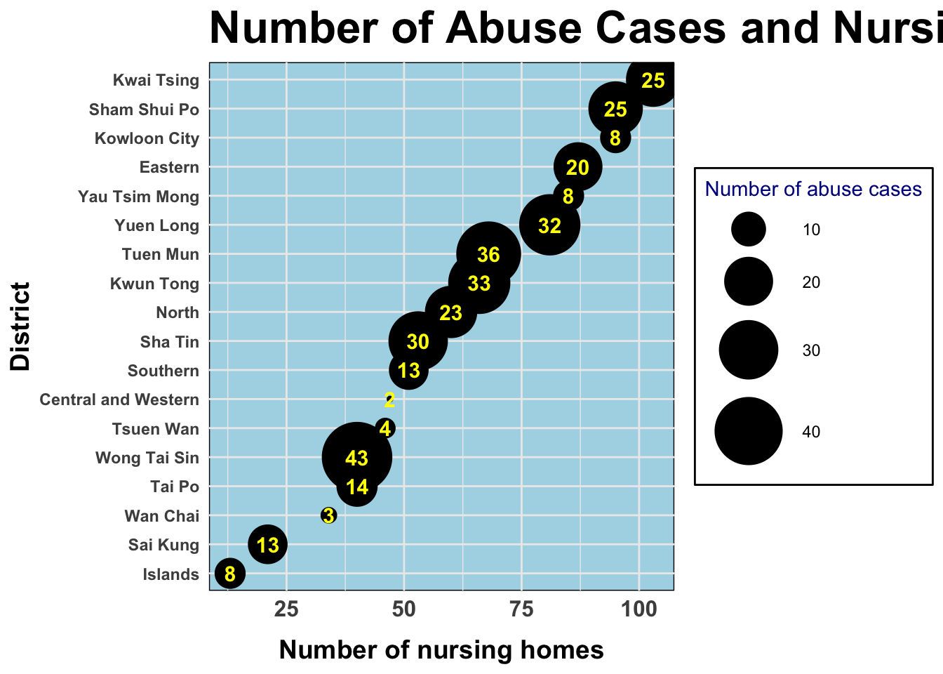
Which residential district in HK has the most elder abuse cases and nursing homes in the most recent year? Is there any relevance between these two factors?
The number of nursing homes in each district in 2022
# calculate the total number of nursing homes in each districts and name it as n_sum1df_map1 <- df_nursing |>mutate(n_sum1 = n1 + n2 + n3 + n4 + n5 + n6 + n7)
The number of elder abuse cases in each district in 2022
# calculate the total number of cases in each districts and name it as n_sum2df_map2 <- df_cleaned |>filter(year ==max(year), question =="Residential District of Elderly Person Being Abused") |>group_by(answer) |>summarize(n_sum2 =sum(n_case)) |>filter(n_sum2 !=0) |>rename("district"="answer")
Merging the two data frames
df_map3 <- df_map1 |>left_join(df_map2, by =c("district"))
Question1 - Visualization
# create a scatter plotp <- df_map3 |>mutate(district =fct_reorder(district, n_sum1)) |># reorder by the number of nursing homesggplot() +geom_point(mapping =aes(x = n_sum1, y = district, size = n_sum2)) +geom_text(mapping =aes(x = n_sum1, y = district, label = n_sum2),size =4,color ="yellow",fontface ="bold") +# add text labels to the pointslabs(title ="Number of Abuse Cases and Nursing Homes in 2022",x ="Number of nursing homes",y ="District",size ="Number of abuse cases") +theme_minimal() +scale_size_continuous(range =c(1, 17)) +# adjust the size range of the dotstheme(legend.position ="right") +theme(panel.background =element_rect(fill ="lightblue"),legend.background =element_rect(fill ="white"),legend.title =element_text(color ="darkblue"),axis.text.x =element_text(face ="bold",size =12),axis.text.y =element_text(face ="bold"),axis.title.y =element_text(size =14, face ="bold", hjust =0.5),axis.title.x =element_text(size =14, face ="bold", hjust =0.5,margin =margin(t =10)),plot.title =element_text(face ="bold",size =24)) +# adjust the title and text of legendsguides(color ="none") # ensure no legend for color of the points# save the plot as a fileggsave("out/plot2.png", p, width =11, height =6, dpi =300)p
Question2 - Analysis
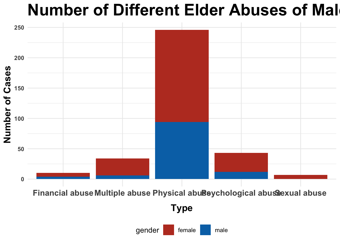
For the male and female elderly respectively, which are the three most common types of elder abuse in HK in the most recent year?
The number of male cases in 2022
# calculate the number of male cases of each typedf_male <- df_cleaned |>filter(question =="Type of Elder Abuse and Sex of Elderly Person Being Abused", year ==max(year),str_detect(answer, "Male")) |>group_by(answer) |>summarize(n =sum(n_case)) |>mutate(gender ="male") # create a new column to clarify the genderdf_male$answer <-gsub(" - Male", "", df_male$answer) # clean up the type labels
The number of female cases in 2022
# calculate the number of female cases of each typedf_female <- df_cleaned |>filter(question =="Type of Elder Abuse and Sex of Elderly Person Being Abused", year ==max(year),str_detect(answer, "Female")) |>group_by(answer) |>summarize(n =sum(n_case)) |>mutate(gender ="female") # create a new column to clarify the genderdf_female$answer <-gsub(" - Female", "", df_female$answer) # clean up the type labels
Merging the two data frames
df_total <-rbind(df_female, df_male) |>filter(n !=0) |># delete the types which had zero casesrename("type"="answer","number"="n") # clarify the column names
Question2 - Visualization
# create a stacked bar chartstacked_plot <- df_total |>ggplot(aes(x = type, weight = number, fill = gender)) +geom_bar(position ="stack") +labs(title ="Number of Different Elder Abuses of Male and Female in 2022",x ="Type",y ="Number of Cases") +theme_minimal() +scale_colour_stata() +theme(legend.position ="bottom",axis.text.x =element_text(face ="bold",size =12),axis.text.y =element_text(face ="bold"),axis.title.y =element_text(size =14, face ="bold", hjust =0.5),axis.title.x =element_text(size =14, face ="bold", hjust =0.5,margin =margin(t =10)),plot.title =element_text(face ="bold",size =24)) +# adjust the title and text of legendsscale_fill_nejm() # apply the NEJM color palette# save the plot as a fileggsave("out/plot3.png", stacked_plot, width =11, height =6, dpi =300)stacked_plot
Question3 - Analysis
How has the number of different types of elder abuse cases changed over the years?
# calculate the number of different types of cases from 2005 to 2022df_cleaned |>filter(question =="Type of Elder Abuse") |>group_by(year, answer) |>summarize(n_type =sum(n_case))
`summarise()` has grouped output by 'year'. You can override using the
`.groups` argument.
# create a line plot with multiple linesinteractive_plot <- df_cleaned |>filter(question =="Type of Elder Abuse") |>group_by(year, answer) |>summarise(n_type =sum(n_case)) |>rename("number"="n_type","type"="answer") |>ggplot(aes(x = year, y = number, color = type)) +geom_line(aes(linetype = type, color = type)) +scale_x_continuous(breaks =seq(2005, 2022, 1)) +labs(title ="Number of Different Elder Abuse Over the Years",x ="Year",y ="Number of Cases",color ="Type of Abuse", linetype ="Type of Abuse") +theme_minimal() +scale_colour_stata() +theme(legend.position ="bottom",axis.text.x =element_text(face ="bold",size =12),axis.text.y =element_text(face ="bold"),axis.title.y =element_text(size =14, face ="bold", hjust =0.5),axis.title.x =element_text(size =14, face ="bold", hjust =0.5,margin =margin(t =10)),plot.title =element_text(face ="bold",size =20)) +# adjust the title and text of legendsgeom_point(show.legend =FALSE) +# remove legend for the dotsguides(color ="none") # ensure no legend for color in the points
`summarise()` has grouped output by 'year'. You can override using the
`.groups` argument.
# convert to interactive plotplot1 <-ggplotly(interactive_plot)# save the interactive plotsaveWidget(plot1, file ="out/plot1.html")plot1